METR 361 Spring 2014
Composite Chart Lab
Assignment:
On an eastern U.S. base map, you will construct a composite chart
using the paper maps weather in a real case, given in this lab. For each map located on the website, identify
just those parameters favorable for severe thunderstorms. To do that, use symbols similar to the ones
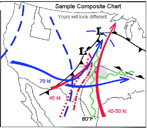
used by Miller. For example, Miller used
different kinds of arrows for jet streams.
You could use arrows that are different colors for different
levels. In the sample composite chart
below, a red arrow is from 850 hPa while a blue arrow
is from 200 hPa.
You must add the maximum wind speed in knots to each arrow, as
shown. Draw them right on your paper
maps.
For other symbols, you should devise different ones to represent
the different favorable parameters you find. Use the sample chart below for
ideas and think of others on your own. You get to figure out how to represent
in symbols all the important ingredients on each map. You must
include a key showing the symbols you made up and the parameters they mean.
Once you have all the maps analyzed, transfer ONLY the symbols to
the blank base map in the same geographic positions. This becomes your composite chart. Then go to the SPC website and read the
discussion for today’s outlook. On a
separate piece of paper, using a format similar to the SPC discussion, you write an assessment of what your composite
map means for this specific case. In
that assessment, identify the important ingredients you found for this severe
weather case and explain what each one brings to the severe weather potential. Also, if any important ingredients favorable
for severe weather are missing, you need to put that fact in your discussion.
Your discussion is only for 00Z, the time of your maps.
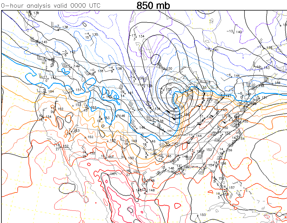
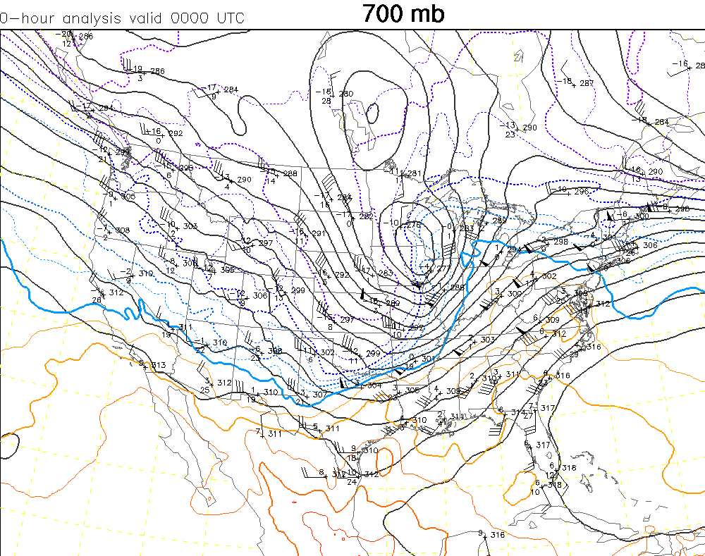
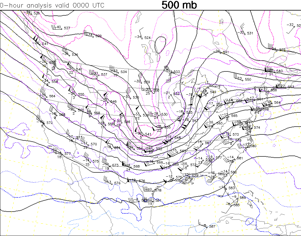
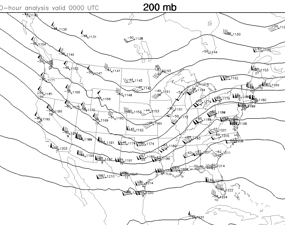
Your analysis maps are as follows (all are 00Z):
US surface plot, 850 hPa, 700
hPa, 500 hPa
heights, and 200 hPa.