METR
361
Spring
2018
Composite
Chart Lab
Assignment
(due next
Wednesday):
On
a U.S. base map, you will construct a composite chart using
weather maps for a real case in which severe thunderstorms were
reported. For each
(paper) map, analyze for the
“ingredients” favorable for a severe thunderstorm
outbreak. For example, on the
surface map, you could draw fronts, pressure troughs, and drylines.
Then assign
symbols to each and transfer only the symbols to a
blank base map. When
you have transferred all symbols from
the plotted maps to the base map, the areas with the most ingredients,
i.e.,
symbols, are the areas most likely to experience severe thunderstorms.
Col.
R.C. Miller and his group pioneered this technique and called it a
composite
chart. We still use
the technique
today.
For
this lab you have 00Z maps from an unspecified but real
outbreak. Something happened. It’s
up to
you to determine where and how intense the severe thunderstorms were.
Normally,
you wouldn’t have the luxury of observed maps at the time of
the severe
weather. In real time, you would need to use forecast maps. But for this lab, we can hindcast
the severe weather. This lab is about the technique.
You
decide which features are favorable on each map.
In my example from the first paragraph, I
used the surface fronts, pressure troughs, and dryline because they
provide
lift. There are other favorable ingredients which you must identify.
Your rough
analyses will not be turned in. You get to devise
your own symbols. Make
them similar in design to the ones used
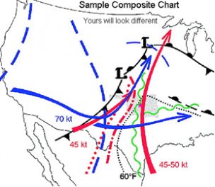
by Miller, shown in the example below.
For example, Miller used different kinds of arrows for jet
streams and
you should too. You must use arrows that are different colors for
different
levels so they can be distinguished from each other.
In the sample composite chart below, a red
arrow is the 850 mb jet
axis while a blue arrow is
the jet axis from 300 mb.
You
should devise different symbols to represent the other
favorable features you find. Use the sample chart below for ideas and
think of
others on your own. To get ideas, you can also read Maddox and
Doswell’s paper
from the 12th Conference on Severe Local Storms
or Miller’s 1972
report (last 2 pages). Both are on our course home page. You must
figure out
how to represent in symbols all the important ingredients on each map.
Don’t
miss any and you must find the favorable ingredients even in
areas which
seem to have no severe thunderstorms. The symbols can be
fanciful, so you
must include a key showing all your symbols and the
ingredients they
represent. You must also draw a second map in SPC convective outlook
format,
showing where and how intense your maps show this outbreak to have
been. Use
the SPC probability nomenclature of MRGL, SLGT, ENH, MDT, and HIGH.
You have the 00Z US surface plot,
the 850 mb, 700 mb, 500 mb,
and 300 mb maps. Hint: This is an event
that occurred before
Spring arrived.