METR 360
Lab
11
The Integrated Data Viewer – Nor’easter Study
Unidata’s Integrated DataViewer, or IDV is a very useful tool for visualization
of atmospheric properties. It can also be
used for determining quantities at high resolution for forecasting or
research. Learning to use the IDV is,
however, not simple. It has a graphical
user interface but there are so many possible viewing options, it can be
daunting. I can show it to you but that
certainly wouldn’t give you any expertise in using the IDV. As always, practice is the key. So the purpose of this lab is to get your
hands “dirty” and test out the IDV for yourself.
Procedure – You will get the IDV running and use it to diagnose an
archived storm as follows:
1. Go into the computer
lab, room 308 and pick any computer other than the older one in the front used
for maps and observations only. Log on using your username and password.
2.
Quick Start
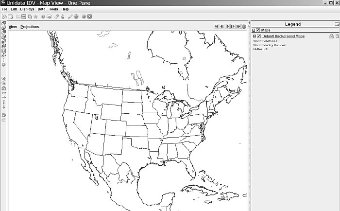
To start the IDV, click on the Applications menu and choose IDV 5.3 at the bottom. It will take a few seconds to initialize, then put up two windows. These are the main operating windows that you need. The one on top is the map view window:
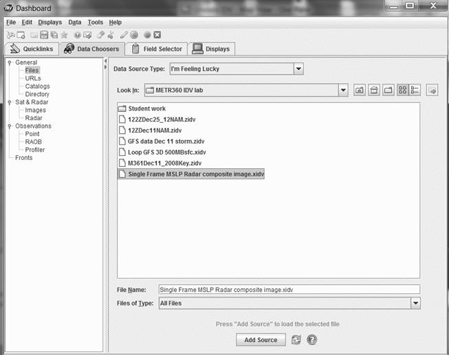
The other window is called the Dashboard. Here is where you control where you get the data and how you display it:
3. Working with the IDV
In the Dashboard, click the tab marked “Data Choosers, as shown above.” That will show a number of “bundles.” A bundle is just a saved IDV state. Once you have set up the displays the way you want them, you can save what you see as a bundle. With the IDV, you can also design your own bundles and save them and you can add to or change the bundles that you find. If you open a regular bundle you see the same types of displays every time, like pressure and temperature, but each time you open the IDV it uses new, current data. You can decide what you want to see. Some bundles carry their own data and are basically case studies. These are called Zipped Bundles. We’ll work with one of those today. By the way, if you make changes to bundles, please save them under a different name so the original is maintained
a. Get Started
To get familiar with the way the IDV works, in the Dashboard click on Files, then open the folder “metr360” (it might already be open - see example above) and click the bundle “Single Frame MSLP Satellite composite image.xidv”. Then click the Add Source button at the bottom of the Dashboard screen. You get an Open Bundle dialog box. The top box should be checked. If it is, click the OK button. Wait a few minutes for the data to load and displays to be created.
Now look at the other window, which is called the Map View.
The Single Frame MSLP Satellite composite bundle is a 2-D display of mean sea
level pressure (MSLP) as colored isobars with a non-enhanced GOES-E IR image
superimposed. Depending on the time of day, you may need to advance the frame
to see the IR image. To do that you use
the frame advance arrow. The IDV can do much more but we will practice simple
navigation using the MSLP Satellite display.
Click the top bar of the Map View window to activate it. Along the left margin there is a series of
icons. To get the map to a view from the
top and aligned with the screen, click the little Home icon (![]() ). Depending on how
big a change this is, the display may reload, taking a few seconds. Clicking the + magnifier icon
). Depending on how
big a change this is, the display may reload, taking a few seconds. Clicking the + magnifier icon ![]() makes it bigger and
the – magnifier makes it smaller
makes it bigger and
the – magnifier makes it smaller ![]() . Moving the whole
display must be done with the arrows
. Moving the whole
display must be done with the arrows ![]() and
and ![]() , not the mouse which is for 3-D. To undo any display change,
use
, not the mouse which is for 3-D. To undo any display change,
use ![]() . For practice, try
zooming in and centering on New York State.
By the way, the mouse wheel will also work for magnifying.
. For practice, try
zooming in and centering on New York State.
By the way, the mouse wheel will also work for magnifying.
b. Other bundles
Go to the top of the map view screen. Under the menu headings (File, Edit,
Displays, etc.), there is a series of small icons. Click the one that looks like a pair of
scissors, ![]() . All the isobars and
satellite information will disappear.
The scissors icon removes all displays and data sources from the
dashboard.
. All the isobars and
satellite information will disappear.
The scissors icon removes all displays and data sources from the
dashboard.
Go back to the Dashboard. Click Data Choosers. Click the bundle “Loop GFS 3D 500MBsfc.xidv” and click the Add Source button. When the Open bundle dialog box comes up, click OK and wait a bit.
On the Map view screen you will see a multicolored 500 mb animation. This
is a 5-day forecast from the latest GFS run.
It can be animated if you click the forward arrow (![]() ). You can stop it
with the pause icon,
). You can stop it
with the pause icon, ![]() . Advance one frame at
a time with the frame advance arrow (
. Advance one frame at
a time with the frame advance arrow (![]() ).
).
Now, do this carefully: Put the cursor anywhere in the map itself, click AND HOLD the right mouse button, and move the mouse slowly forward while holding the button. The map will be rotated so that you can appreciate the fact that this is a 3-D 500 mb surface. By holding the right mouse button and moving the mouse, you can rotate the map view all the way around the even view it from underneath. Try moving in various ways, even while the map is looping. Notice how the yellow areas are high (ridges) while the blue areas are low (troughs).
Having trouble getting it right-side up again? Click the Home icon, above the movement
arrows. It might take a few seconds for
the black contours to reappear. The data
is all loaded but you changed the view so the IDV has to re-map them. You probably will want to zoom in (![]() or use the mouse wheel).
or use the mouse wheel).
On the right side of the Map View is the Legend. Each display is shown. The 500 mb surface is obscuring the GFS precipitation forecast which is also part of this bundle. To see the precipitation, click the two boxes for Geopotential height isobaric to uncheck them.
What happens if you load in another bundle but “forget” to clear the display using the scissors icon? Go back to the Dashboard. Click Data Choosers again. Click the bundle named “Composite Radar.xidv” and the Add Source button. This is the radar loop for the last two hours. You could add to this display, superimposing the MSLP, radar, 500 mb, or any other field by unchecking the Remove box on the Open bundle dialog box now on the screen. Keep the check on the second box to add displays. Advance the frames until you see radar echoes. Compare them to the forecast precipitation.
c. Designing displays
You can make 2D and 3D displays of your own choice. First, click the scissors icon. As we now know, that removes the old displays and any data sources previously loaded when you chose the bundle. The map remains. Now we’re going to add Fields.
Go to the Dashboard. Click the Data Choosers tab. Now go down the menu past Files and URLs to Catalogs. Click it. The first catalog listed is Unidata Model Data.
There’s a small lever icon next to each folder. Choose the Unidata
Model Data and click the lever.
It now points down and there are more
choices. Choose Forecast Model Data and click the lever. Choose the North American Model which is the
At this point, the Dashboard
switches you to the Field Selector tab automatically. Turn down the lever on the 2D grid and again
on Temperature. Pick Temperature@Ground
or water surface. Over on the right, you
should pick a display type. Let’s do
Color-filled Contour Plan View.
You need to choose a time or
series of times or the IDV will use all available times by default. Remember, the
To remedy that, first click
the Use Default box and make it Use Selected.
For this example, click just the first time shown, probably
12:00:00Z. Click the Create Display
button. The map will very quickly be
colored. These are the surface
temperatures at the model initialization time. Zoom in for more detail. It would be nice to see the isotherms where
the colors change and some numbers, too!
Go back to the Dashboard
(that happens a lot, doesn’t it? The
Dashboard is your main control on what gets shown). The IDV is now showing the Display tab. Click the Field Selector tab. We’re going to leave everything the same as
shown, except change Color-filled Contour Plan View to Contour Plan view and
click Create Display.
Other than a bit of flashing,
nothing seemed to change. That’s because
the IDV is using the same color scheme for the isotherms as it did for the fill
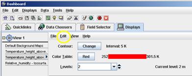
colors. Let’s change that. Go back to the Dashboard. The Display tab is now showing and it’s for
the Contour Plan View that you just created.
The Color Table is showing
the word “Temperature”. Click it once and you will see more choices for a Color
Table. Pull the cursor down to Solid,
hold it there a second, then carefully move the cursor right to pick Red. Click it.
Go back to the Map view to see your red isotherms. Hopefully some of them will be labeled with
their value. If not, do this: Where it
says “Contour:”, click the button marked Change. In the Contour Properties
Editor that you get, move the Frequency slider from Lo to Hi. Click OK. Now you have lots of labels. They are
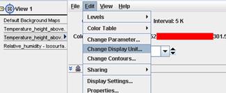
probably in Celsius degrees. To change
that, go to the dashboard display view, pull down the Edit menu next to the
View line:
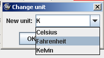
Choose Change Display unit
and pick Fahrenheit from the menu which results. You might want to change the
contour interval. The default is 9 degrees F. You can change it in the Contour
Properties Editor.
By the way, if you do the
right-mouse motion again, you will see that this display is NOT 3D. It’s flatter than a pancake since 2D is what
you requested. Not seeing state
boundaries? On the Map View, click
Default Background Maps and check Hi-Res US to get a better U.S. map.
Of course, you could choose
more than one time and get an animated display.
If you do that, remember, it will take longer to load, especially using
Now that you know the basics,
play with it. Load other types of data
and different types of displays. The IDV
can do a tremendous variety of tasks and show you lots of displays.
4. Assignment (due next Wednesday)
Clear all displays and data. Go to Data
Choosers. Under the word “General” click Files.
Open the folder IDVLab. Click GFS Jan 27
2015.zidv and click Add Source. When the Open Bundle dialog box comes up, check
the Remove box and click OK. Then
another dialog box asks you if you want to write files to a temporary
directory. Click OK again. We’re using
the GFS for fast loading. This display
is only sea-level pressure and 6-hour precipitation forecast but most of the
GFS is available by using the Field Selector.
You should add whatever displays you need to answer the questions. This is graded:
Based on the GFS forecast, answer the
following questions on a separate sheet of paper or in a text file. If you write a text file, send it to me via email
(Jerome.Blechman@oneonta.edu):
1. The storm we are studying occurred on January 27, 2015. When and where is that surface Low most intense? Be specific and quantitative (use numbers!)
2. You have a paper copy of the isobars, isotherms, and 1000 mb wind flags for 00Z on Jan 27, 2015. Draw in the fronts in the places consistent with those data fields. Use the standard symbols and colors.
3. Add 500 hPa heights for all times. (Hint: 500 hPa is a Geopotential height. Find that using the Field Selector) When and where is the 500 hPa Low most intense? Again, give numbers. You might find this easier if you uncheck all boxes in the Legend, except for the Geopotential Heights and Default Background Maps.
4. In the Dashboard under “Derived”, add wind barbs at 300 hPa. You may need to skip some winds to make it readable. What can you say about the winds? Make at least two observations about what you see. Whenever possible, make them quantitative.
5. The upper air pattern you see over the eastern U.S. is a cut-off Low. What characteristics of this upper air trough tell you it is cut off?
6. Add the 2D 1000-500 hPa thickness (again under the Derived menu). I like to make these solid red since the default 500 mb height line color is blue. You can choose the color table as we did before. Remember you can uncheck the precipitation and put it back when you need it. Notice that the thickness pattern does not match the 500 hPa pattern exactly, although it is very close in most places. At 12Z on Jan 27, the two fields differ the most over southern New England where the impacts were greatest. That is not a coincidence. How does the difference between thickness and height cause the heavy snowfall?
7. Go back to the first frame at 00Z on Jan 25. How is the 500 hPa pattern different at that time from the one at the time of the greatest intensity in the blizzard? There are several important differences. Find two and describe them completely.
8. In cities such as Philadelphia and Atlantic City, schools were closed in advance and the governors issued states of emergency. Based on the sequence of maps shown by this GFS forecast made two days in advance, what would have been the proper forecast? Based solely on this GFS forecast, give a short summary of the expected synoptic situation. Then use the GFS to forecast the snowfall total for Philadelphia for January 26 and 27, 2015. Do not look up what actually fell. Your forecast must be based on the guidance you have.