Project 1
Project due Monday, September 18th
Develop your first website for 4 different screen sizes using HTML and CSS elements.
Controling webpage sizes and how they change depending on screen size. Please review and read the links in the right hand menu. We will go over the menu together. Please become familiar with CSS Margin and CSS Padding also. We will do more with this in the next assignment.
- Creating pages at different sizes
- Internal CSS
- Organizing content on the page
- Navigation
- Image optimization for web
- Page backgrounds
- Linking
Internal CSS Example:
HTML Example:
CSS Menu Example:
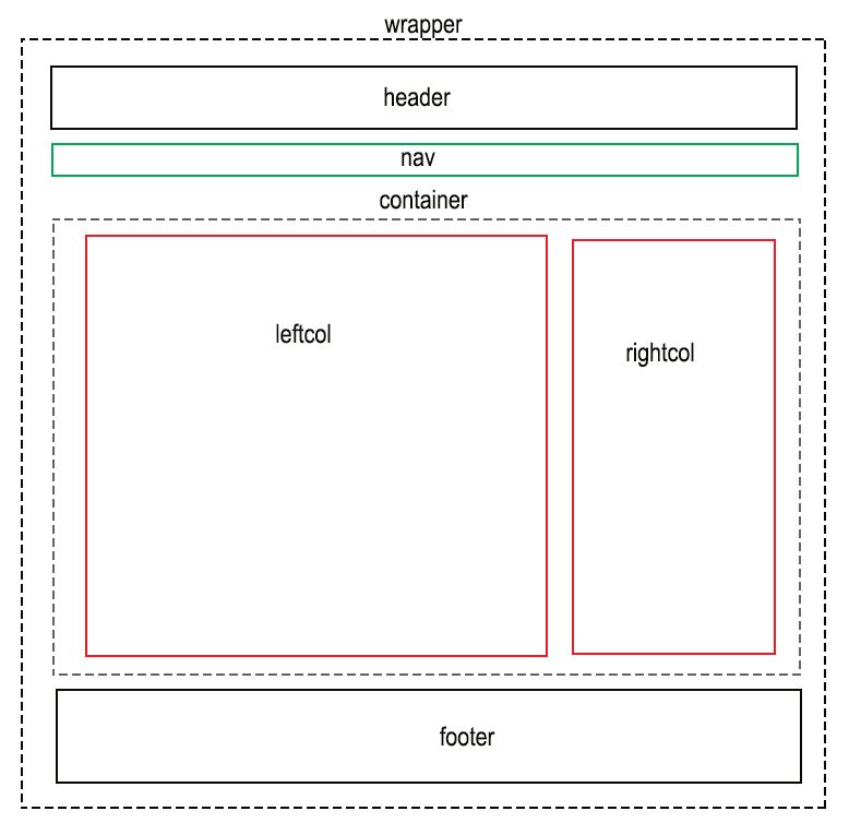
Example of layout
Using Headings
In order to follow best practices for web accessibility, you must use headings to help the organization of the content on a page. Web browsers, plug-ins and assistive technologies such as screen readers use headings to help the user navigate the page.
Heading Ranks
Headings are organized according to rank, and size. The most important (and largest) heading has the rank 1 (<h1>), while the least important (and smallest) heading has the rank 6 (<h6>).
Whenever you start a new section of the page, you should use a heading with a value that is the same or higher as the one before it. Skipping heading ranks, going directly from <h2> to <h4>, can be confusing to screen readers. If you are starting a new subsection within the higher-ranked section, you should use a heading with a lower rank.
Page Title: Your Page Title <title>Page Name</title> should Refect your Page H1 Heading.
<h1>This is heading 1</h1> - Reserved for Page Title
<h2>This is heading 2</h2>
<h3>This is heading 3</h3>
<h4>This is heading 4</h4>
<h5>This is heading 5</h5>
<h6>This is heading 6</h6>
You can laern more about headings at w3schools.com.
CSS Margins
The CSS margin properties are used to generate space around elements.
The margin properties set the size of the white space outside the border.
CSS Padding
The CSS padding properties are used to generate space indside elements.
If the margin/padding property has four values:
- margin/padding: 25px 50px 75px 100px;
- top margin/padding is 25px
- right margin/padding is 50px
- bottom margin/padding is 75px
- left margin/padding is 100px
If the margin/padding property has three values:
- marginpadding: 25px 50px 75px;
- top margin/padding is 25px
- right and left margins/padding are 50px
- bottom margin/padding is 75px
If the margin/padding property has two values:
- margin/padding: 25px 50px;
- top and bottom margins/padding are 25px
- right and left margins/padding are 50px
If the margin/padding property has one value:
- margin/padding: 25px;
- all four margins/padding are 25px
Key Links
Lorem Ipsum
- http://www.lipsum.com/
HTML Colors
- https://www.w3schools.com/colors/
Color Picker
- https://www.w3schools.com/colors/colors_picker.asp