Project 3 - Mobile
Project due Monday, October 30th
Develop a five page responsive website about an Inventor, using HTML and external CSS elements.
Required:
- External CSS file
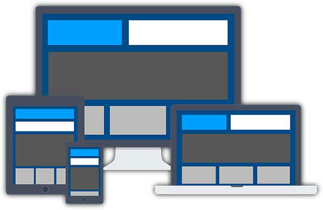
- three pages that adjust to three different devices
- Subject will be an Inventor who contributed to the world of technology and design.
- Inlcude all of the elemets from Project 1 and Project 2 we have learned so far.
Your site should reflect understanding of all the things you learned in assignment 1:
- Page size control
- Padding and margin styles
- Image optimization, and show control of file size, format, width and height - Never size an image wider than your targeted screen size
- Appropriate page titles for each page
Objectives
- Design consistency
- External CSS
- Mobile Design
- Media Queries
Viewport
The viewport is the user's visible area of a web page.
<meta name="viewport" content="width=device-width, initial-scale=1.0">
A <meta> viewport element gives the browser instructions on how to control the page's dimensions and scaling.
The width=device-width part sets the width of the page to follow the screen-width of the device (which will vary depending on the device).
The initial-scale=1.0 part sets the initial zoom level when the page is first loaded by the browser. For more about viewport please review w3schools.com
Media Queries
Media queries are useful when you want to apply CSS styles depending on a device's general type (such as print vs. screen), specific characteristics (such as the width of the browser viewport), or environment (such as ambient light conditions). With the huge variety of internet-connected devices available today, media queries are a vital tool for building websites and apps that are robust enough to work on whatever hardware your users have. More infomraiton on media queries from Mozilla Developers site.
Code Examples /
/* Simple fluid media Note: Fluid media requires that you remove the media's height and width attributes from the HTML http://www.alistapart.com/articles/fluid-images/ */ img, object, embed, video { max-width: 100%; }
Fist Level will respond as mobile. Mobile Layout. */400 <
@charset "utf-8";
/* Simple fluid media
Note: Fluid media requires that you remove the media's height and width attributes from the HTML
http://www.alistapart.com/articles/fluid-images/
*/
img, object, embed, video {
max-width: 100%;
}
/* IE 6 does not support max-width so default to width 100% */
.ie6 img {
width:100%;
}
/* Tablet Layout: 481px to 960px. Inherits styles from: Mobile Layout. */
@media only screen and (min-width: 481px) {}
/* Desktop Layout: 960px to a max of 1232px. Inherits styles from: Mobile Layout and Tablet Layout. */
@media only screen and (min-width:960px) {}
Live Example:
http://employees.oneonta.edu/bugyijp/cart206/example.html
Readings
Key Links
Famous Inventros
Lorem Ipsum
- http://www.lipsum.com/
HTML Colors
- https://www.w3schools.com/colors/
Color Picker
- https://www.w3schools.com/colors/colors_picker.asp